In the summer of 2026, Laura approached me and my web designer partner, Donny, to support her in a longtime dream of opening a daycare in her community. She needed a website that would help her communicate the unique offerings of her daycare, like below market rates, date night opportunities for parents, and teaching kids about sustainability. Together, we embarked on a partnership to bring Lo's Little Learners to life, from a brand identity all the way to a responsive website.
Scope: 5 months
Software used: Procreate, Adobe Illustrator, Canva, Figma
Team of stakeholders:
Laura Davis (Owner)
Donny Brower (Web Developer)
My role: Brand and Web Designer
Software used: Procreate, Adobe Illustrator, Canva, Figma
Team of stakeholders:
Laura Davis (Owner)
Donny Brower (Web Developer)
My role: Brand and Web Designer
Part One:
"We need the building blocks."
"We need the building blocks."
Our first challenge when Laura sought Donny and I out was to create a scope and project roadmap. Before we could build a website, I knew we needed to start with the "building blocks": A brand identity. Building in time for me to design this visual identity meant delaying website launch, but with discussion and planning we built a project roadmap that worked for everyone. So, while Donny got to work on website content and structure, Laura and I got to work discussing the values and personality of Lo's Little Learners.
I began by walking Laura through a brand journey document I developed from previous branding projects that covers everything from a mission and vision statement, to a brand archetype, to colors, images, and moods.
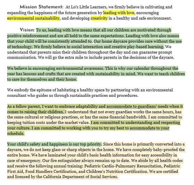
The Mission/Vision section of Laura's Brand Journey document.
Laura had already thought through her mission and vision thoroughly, but had less opinions about the visual look and feel of her brand. However, in discussing her mission and vision with her, I was able to translate the most important parts of it into visual elements. For example, the use of the color green became important to illustrate her commitment to sustainability.
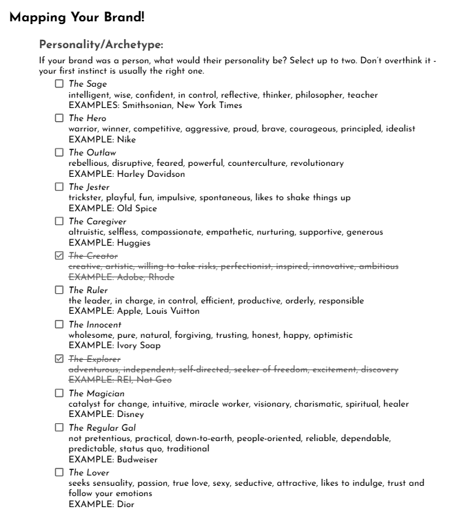
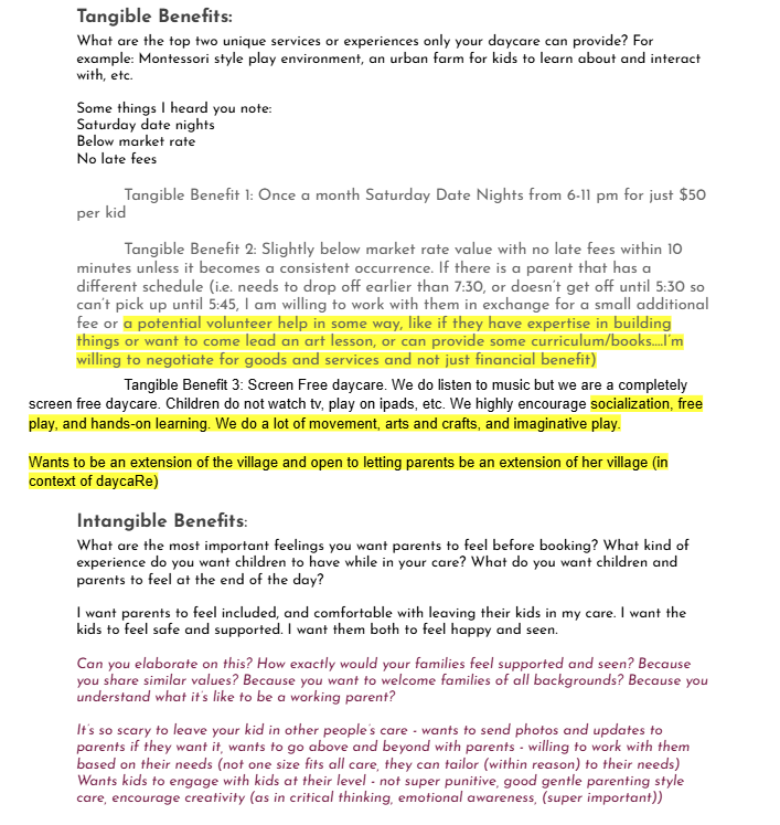
Getting into the details, Laura provided more information about her brand's personality and benefits she will provide to her community. After she was done filling out the Brand Journey document, I highlighted some deeper questions for her to think through in maroon (see right).
As we ventured further into the Brand Journey, I identified a central theme of her brand: A deep passion for the personal development of the kids in her care, and by extension being a strong community resource to their parents. I was surprised to learn that under the Personality/Archetype section, she did not identify Lo's Little Learners as a "Caregiver" archetype. This did not mean that she did not want to communicate a caregiving and nurturing environment. On the contrary, the concept of "love" became a central theme, but it was most important that her daycare be a safe and fun environment to be creative, embrace diversity, and that will teach children to care for their environment and their community. Thus Lo's Little Learners is more aligned with the Creator and Explorer archetypes.
The Elephant
Early on, Laura shared that her favorite animal is an elephant. I knew instantly this was going to be a central feature of her brand. The elephant represented the fun, caring, and wise aspects of her daycare. As we got further into brainstorming, she also talked about the symbiotic relationship between birds like egrets and oxpeckers and the elephants they perch on. We realized this is a strong metaphor for the diversity and community values of Lo's Little Learners. It would also represent her commitment to teaching care for the environment. I drew several iterations of the elephant and egret with various organic elements, like leaves and flowers, and elements that represent ideas, creativity and learning, like a lightbulb.
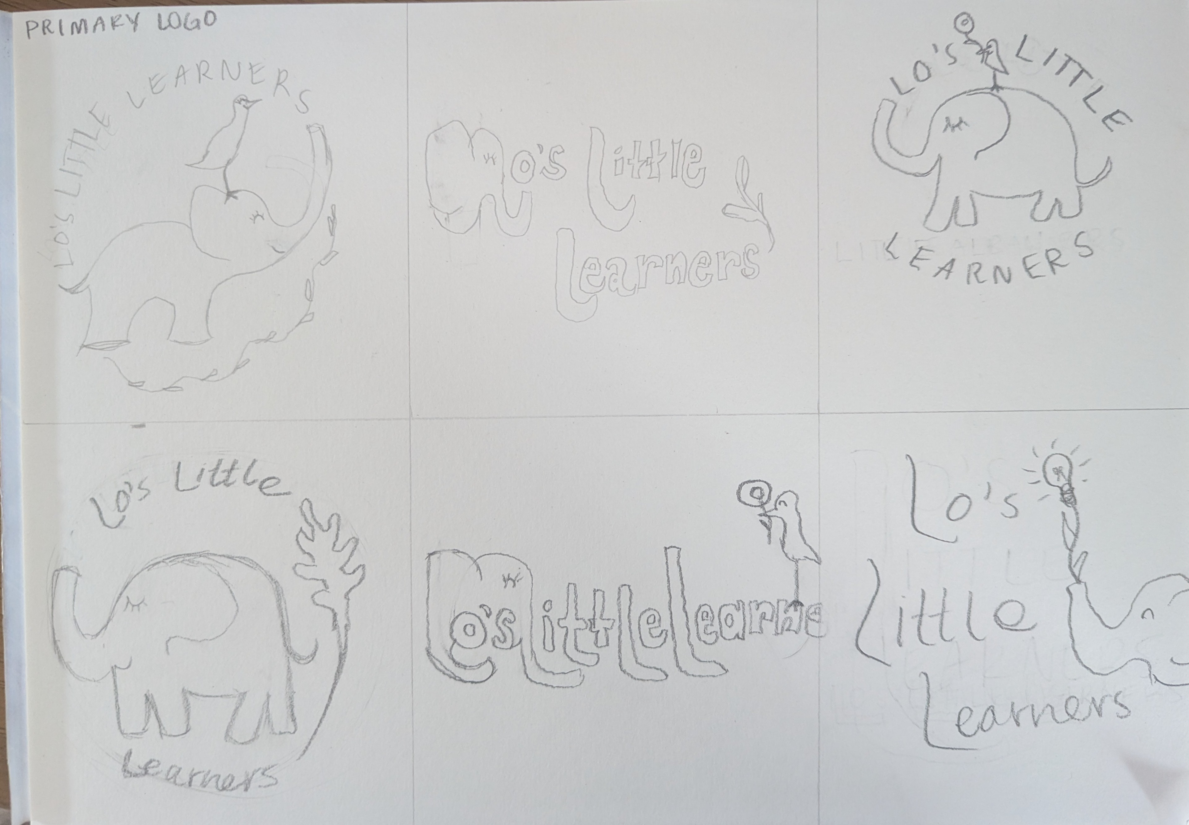
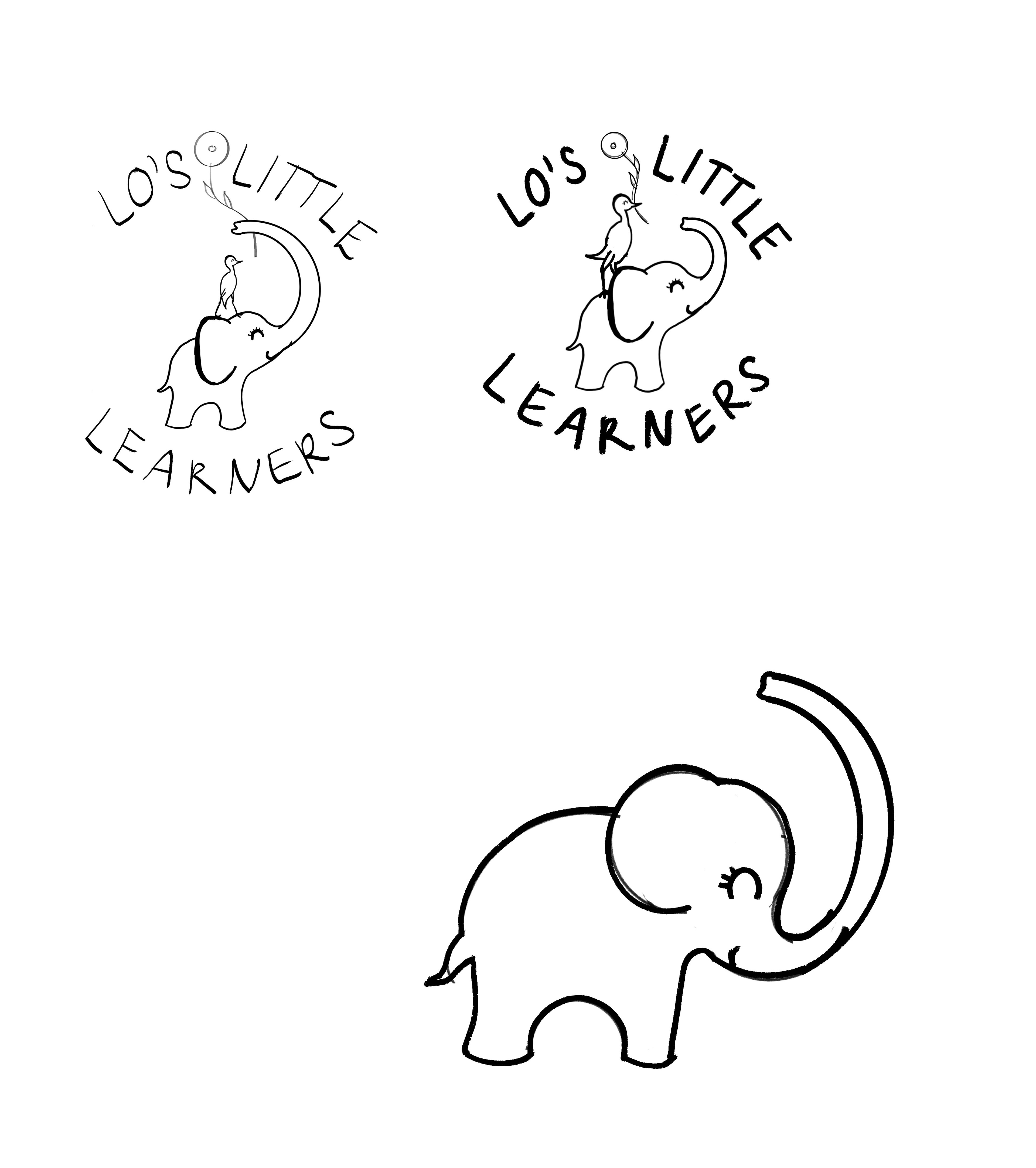
Some of my preliminary logo sketches. (Always gotta muddle through the bad to get to the good, eek!)
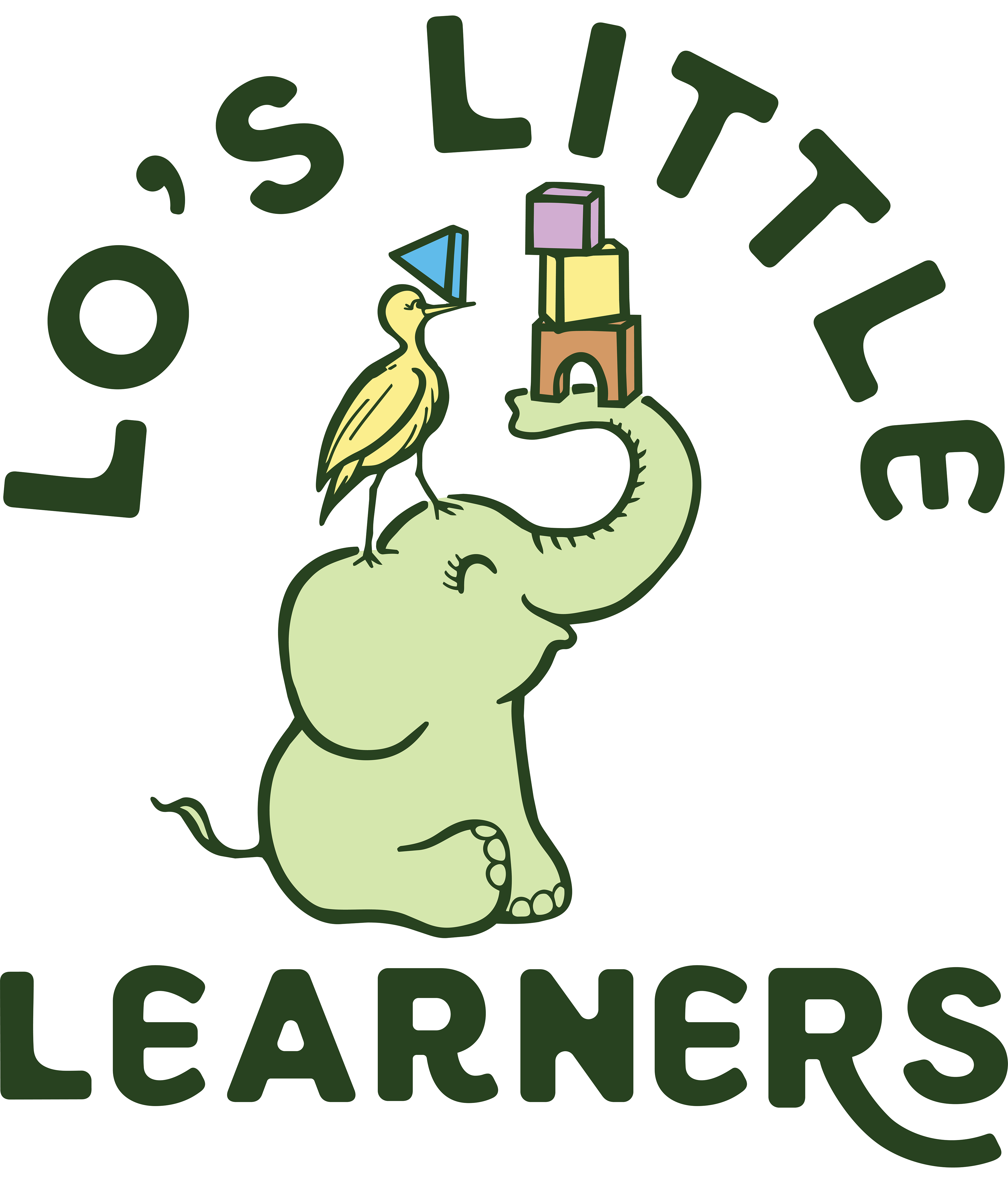
When I finally landed on an idea, I drew and refined the final illustration in Procreate, then took it into Illustrator to vectorize it, add color, and combine it with the typography.
The final product below captures all of the most important values she wanted to highlight: love, creativity, safety, fun, sustainability, diversity, and care. I decided incorporating building blocks into the drawing represented the unspoken, but the most important undercurrent of her work: To build up the next generation to be kind, self aware, and wise members of society.
We always need the building blocks. ;)
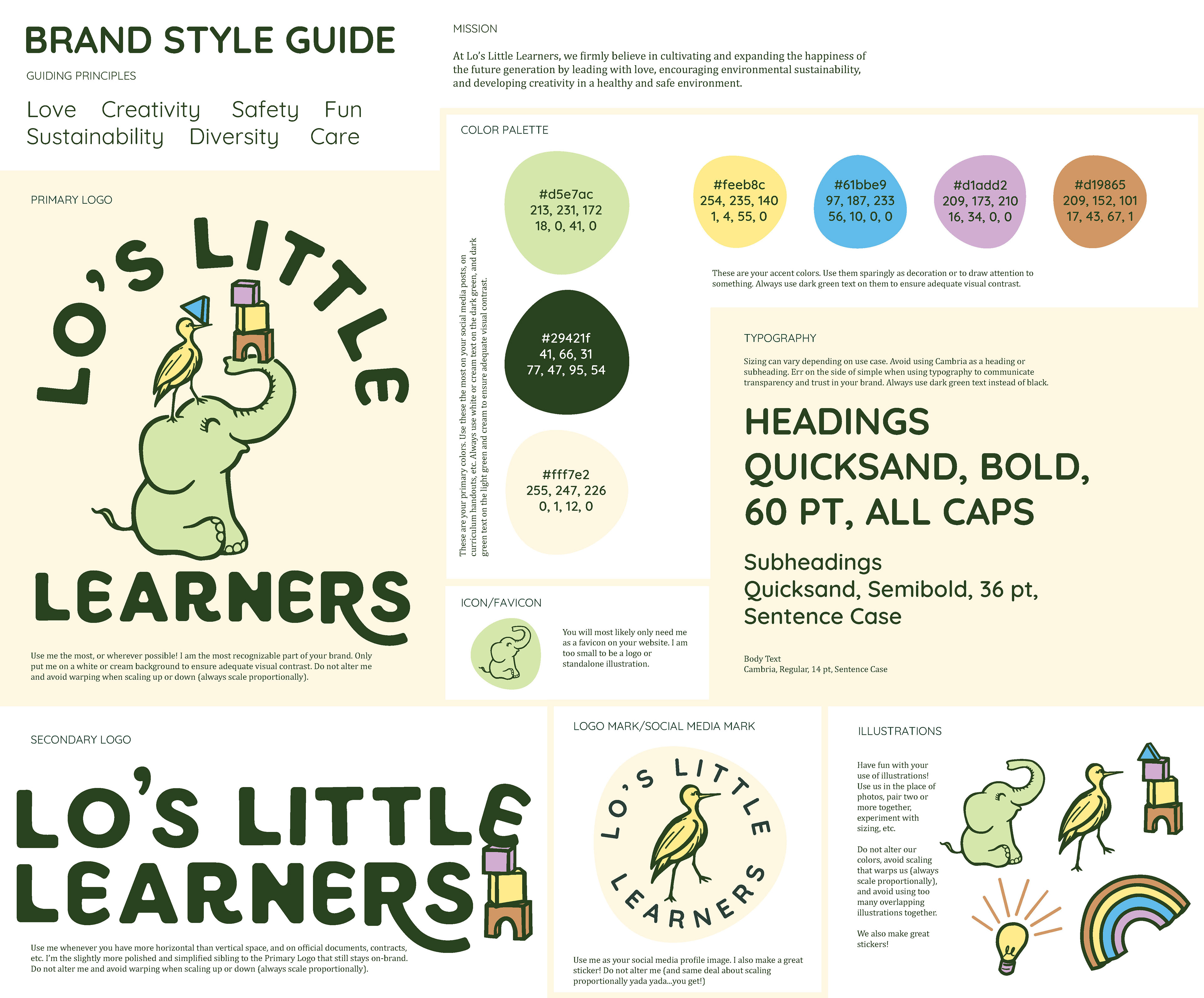
Once I had the elephant, the rest of the brand came together. We discussed balancing "natural elements and colors" with bright, kid-oriented colors. I also created additional illustrations to not only give her more branding elements to work with, but in the event she wouldn't have many photos to share in the future (due to child privacy) she would at least have plenty of imagery to use and reuse again and again. See her final style guide below.
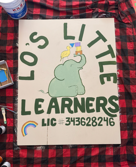
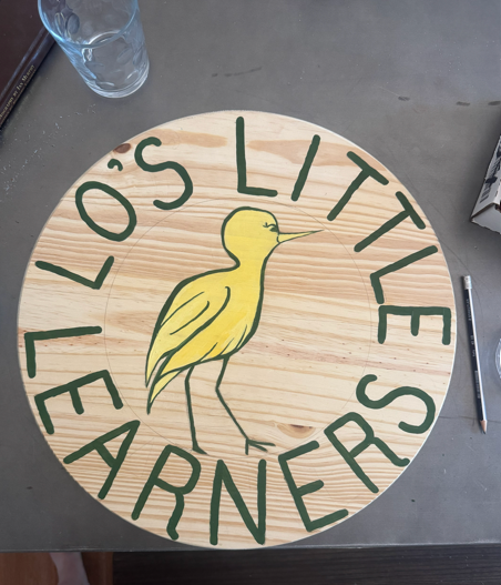
Laura was thrilled with the end result and has even hand painted signs using her logos!
I learned so much in this process, not only more about Laura, but about how a daycare brand is so much more than a logo and illustrations. It represents hope for the future; a place where little learners will grow up to hopefully work together and make the world a better place, one building block at a time.
Stay tuned for Part Two: Lo's Little Website
Coming soon...