Menno is a hair salon and community space in Midtown Sacramento. Founded in 2025, Menno was an idea born from a combined love for beauty and wellness, with a deep understanding that both are intrinsically linked. Their mission is to create a fun, peaceful and approachable space where all individuals feel seen, celebrated, safe, and rejuvenated.
I brought the Menno visual brand to life in 2025.
Scope: April 2025 - Branding Meetings and Design;
July 2025 Merchandise Meetings and Design
July 2025 Merchandise Meetings and Design
Software used: Adobe Illustrator
Team of stakeholders:
Shalya Wynne (Co-Founder)
Ali Clifford (Co-Founder)
My role: Brand Designer
Shalya Wynne (Co-Founder)
Ali Clifford (Co-Founder)
My role: Brand Designer
Part One: Visual Brand
Before meeting in-person with Shayla and Ali to discuss their vision for Menno, I developed a questionnaire to lay the groundwork of bringing their visual brand to life. On this form, they answered questions like, "What are your values.", "What tangible and intangible benefits will Menno bring to its clients?", and I even narrowed in on their brand "archetype" (the Jester Creator).
This questionnaire covered a lot of ground before we started discussing their ideas for visuals. Shayla reflected that it was super helpful to have such an organized way to lay out all of their thoughts and ideas, and really hone in on "who" Menno is. Together, over coffee, we went through the questionnaire and I was able to "meet" the Menno brand for the first time.
The name "Menno" comes from the way Sacramentans pronounce "Sacramenno." They wanted their brand to become a staple in the amazing small-business community in Sacramento.
Prior to meeting, they also sent me their Pinterest moodboard which allowed me to start creating my own moodboard. We went through both of these together and they started to pull out visuals, color palettes, and an overall visual scheme that resonated the most. Below is my final moodboard.
Shayla and Ali's ideal clientele "travel, read, move their bodies, like to talk about the “real-life” stuff (politics, sex, philosophy, you name it), and are chasing a deep understanding of self and the world around them." Not only were they building a salon, but they also offer wellness services like head spas, reiki, and sound baths. They wanted their clients to feel light, beautiful, comfortable and relaxed. Their brand needed to be approachable, community-oriented, fun and high-end, but NOT stuffy. The visuals had to combine fashion and beauty with mental/spiritual wellness.
Based on this information, I developed two draft branding concepts for them to pick and choose from.
Option 1
Option 2
It was decided that Option 1 was a better match to what they envisioned for their brand, and they didn't request many changes. I got to work finalizing the details, laying out color variations, and adding a set of illustrations. Below is their final brand style guide.
Overall, I am proud of the balance I was able to strike between approachability and high-end quality. I was also able to capture Sacramento's essence in the palm tree and camellia flower details. Shayla and Ali were overjoyed with the end result and even used my designs to decorate their space and really bring the "Mennoverse", as they like to call it, to life! Seeing my brand design taken one step further like this, from simple graphic design, to what will certainly become a household name in Sacramento was most rewarding of all.
A mural of one of my illustrations was painted on a wall in the salon.
Part Two: Merchandise Designs
I was brought in to create a round of merchandise designs in July 2025.
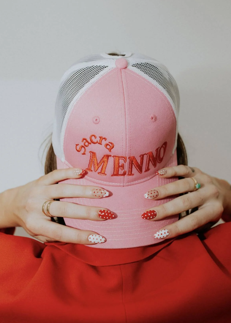
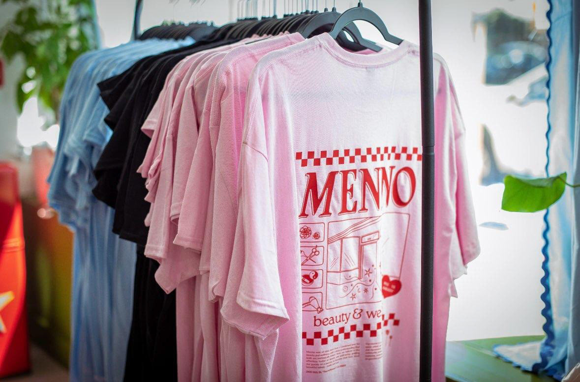
After a frustrating experience "DIYing" some merchandise for Menno's soft-opening, Shayla needed a professional to create designs for their grand opening in August. We agreed on one t-shirt design that would adapt Menno's primary logo into an illustration on the back of the t-shirt and be produced in some of Menno's main colors. She also wanted two hat designs: one that would incorporate the hands illustration I created in their brand style guide, and one that would say "SacraMenno" in a branded font to emphasize brand recognition.
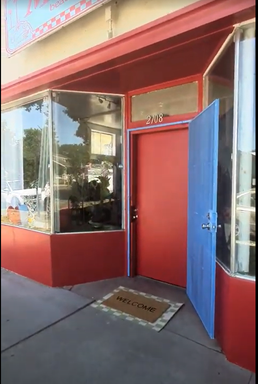
I was fortunate that Shayla trusted me to have fun and play around with these designs, particularly the t-shirt. Shayla didn't have much feedback for what she was looking for so she let me surprise her with a fun illustration. I knew I wanted to incorporate the facade of their building into the design since they would be celebrating the new space with this merchandise launch. The "Miss Ya Already" heart is a nod to a mural they painted on their front door for clients to see as they are leaving. And the text at the bottom is their mission statement, again celebrating the launch of their new business. The hat design incorporated their secondary logo, while also playing with the SacraMenno tagline. Shayla was blown away with the designs and the merchandise is flying off the shelves!
Menno's building facade and front door mural.