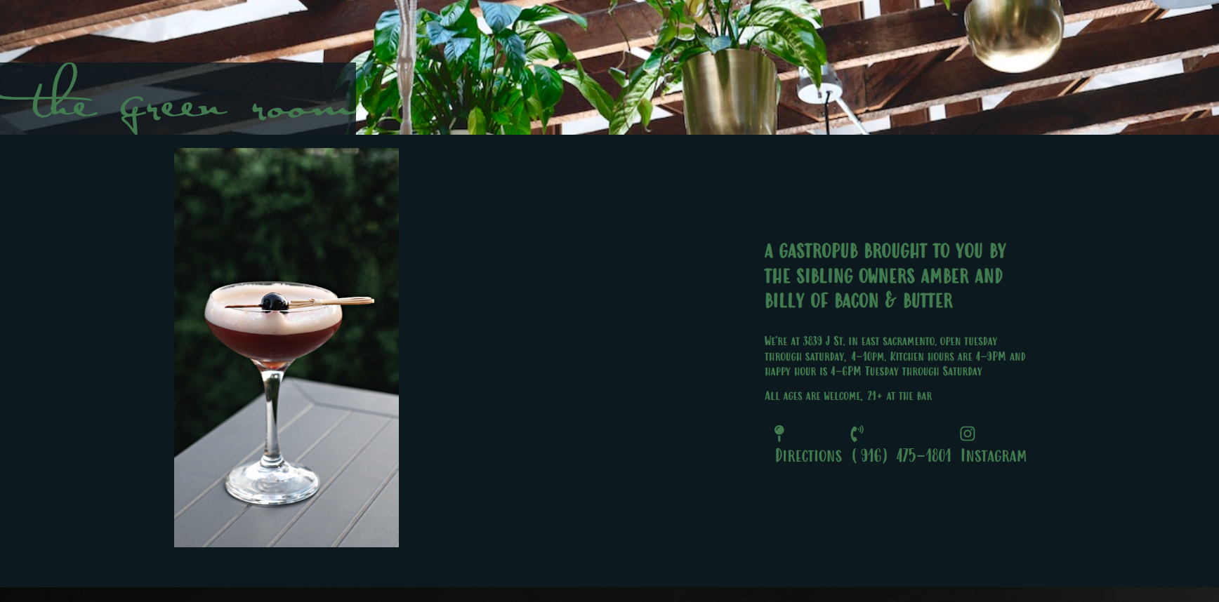
The Green Room is an upscale, farm-to-fork gastropub in the heart of historic East Sacramento. It is co-owned by Amber and Billy, of the restaurant Bacon & Butter, whose website I redesigned in 2022. You can learn more about that here. The same web developer and I came together again to build a new website for The Green Room. We needed to build a site that would strengthen The Green Room’s visual brand and provide a simple, sophisticated place to house their seasonally changing menu.
Scope: 1 month
Software used: Adobe Illustrator
Team of stakeholders:
Donald Brower (Web Developer)
Amber Michel (Co-Owner of The Green Room)
My role: UX/UI Designer
Software used: Adobe Illustrator
Team of stakeholders:
Donald Brower (Web Developer)
Amber Michel (Co-Owner of The Green Room)
My role: UX/UI Designer
The Problem
The Green Room’s existing website was an afterthought as most of their marketing was focused on social media. Our web developer built it simply as a place to house their menu, so it was overly simplified in layout and interface. There were also very few opportunities to show off the plethora of high quality professional photography they had of their restaurant and offerings. In addition, The Green Room’s existing visual brand consisted of only a logo and a typeface, therefore this project would not only be about designing a website, but establishing a clearer visual brand identity.
I was tasked with developing brand assets, and designing a site that was imagery-centered, established a clear visual language, and housed their menu in an agile way to accommodate seasonal changes.
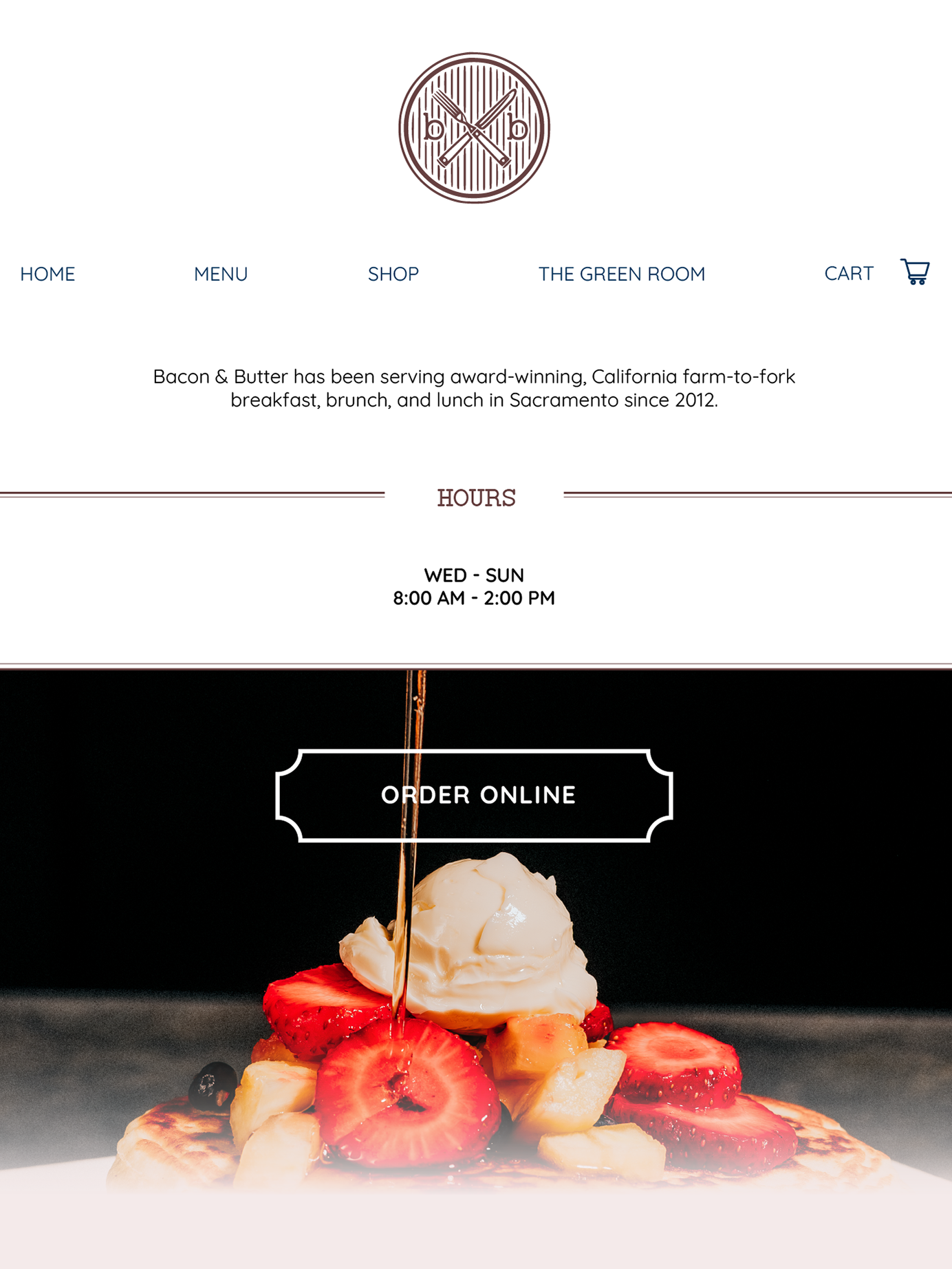
Existing Website
My Approach
Because a central problem was establishing a clearer visual identity, I decided to design the website from the outside, in. Normally, I would start with low fidelity wireframes and work my way up to visual mockups. However, I found it easier to problem solve the visual interface, alongside site structure and layout. This meant I couldn’t be as methodical as I normally would be, but the simplicity of it being a two-page site lent itself well to this approach. (I wouldn’t dare try it on a more complicated, multi-page nonprofit website for example!)
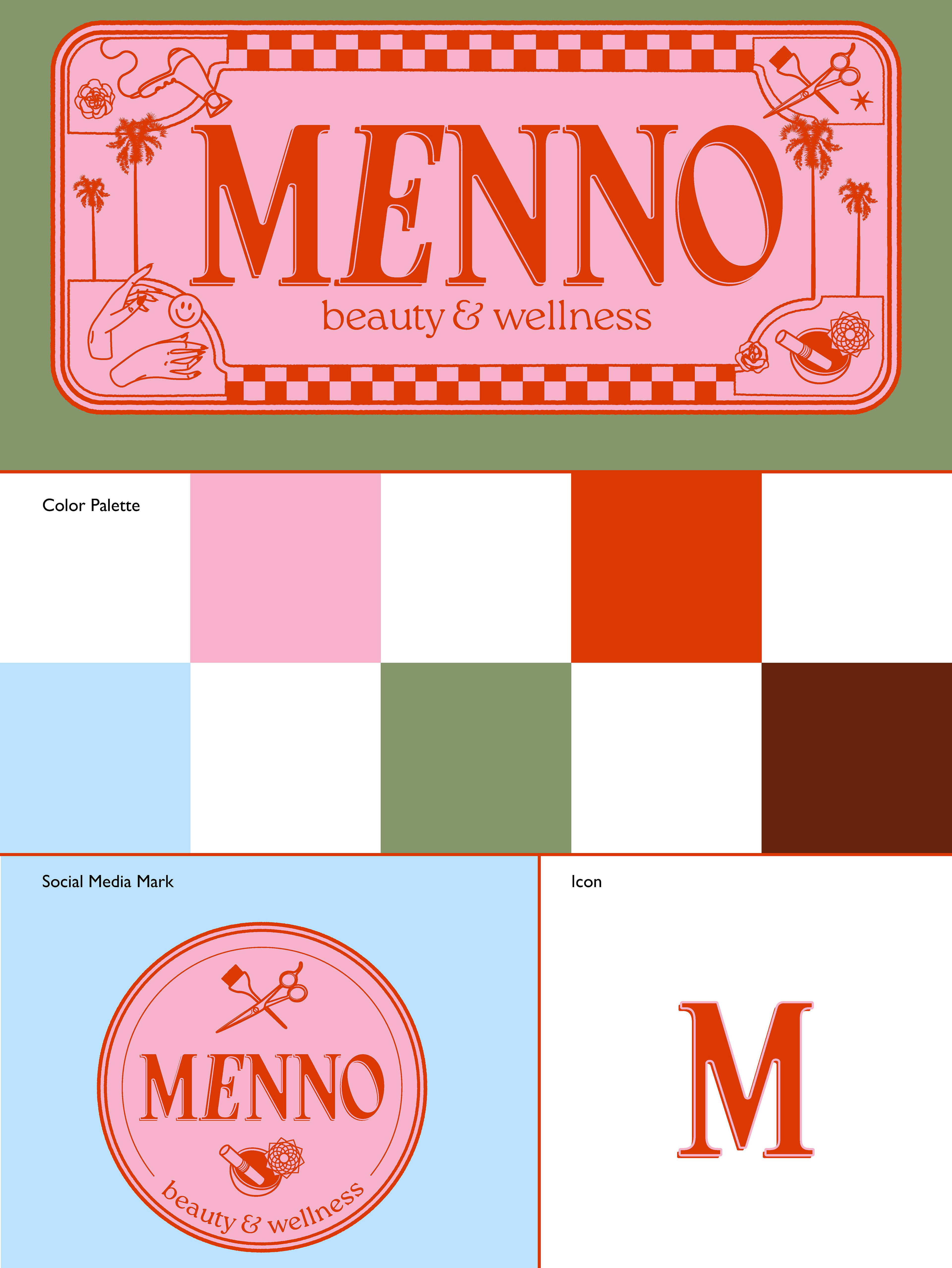
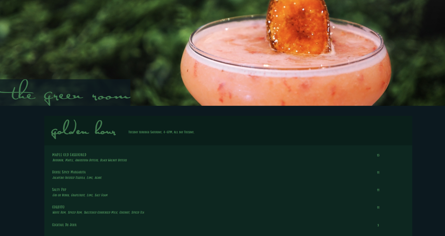
Drawing inspiration from the restaurant’s decor and furnishings and existing logo, I established the basics of their visual brand - color palette, typography usage, and an icon. The icon will not only serve as a site favicon, but as part of a larger illustrative library that can be used on social media and other marketing collateral.

The Green Room's existing logo.
Mockups
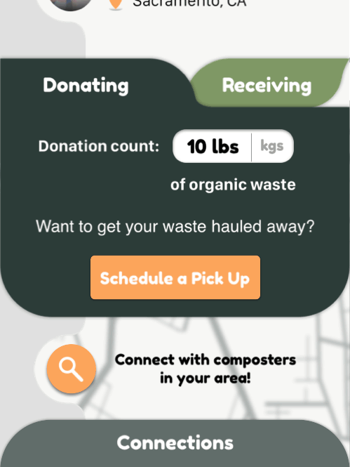
Below are the final mobile mockups (home page on the left, menu page and functionality in the middle and on the right.) The final site design offers opportunities throughout to feature photos and a strong, elegant visual design. I built the menu page with in-page scrolling functionality rather than an endless scroll design or a page-by-page accordion-like design (illustrated on the right). This compromise allows the bounding boxes to remain agile but users can still scroll through easily without getting lost or frustrated (there’s nothing worse than that when you’re hungry or can’t decide what to order!)
The desktop and tablet mockups allow the menu to easily expand across screens while still allowing for seasonal changes.
Integrating the Brand
I found fun ways to fully integrate the visual brand throughout the site's buttons and elements. I even incorporated branded colors into the map widget.
Conclusion
While my approach was less methodical and more organic, I am ultimately thrilled with the result. I built a design that reflects The Green Room’s elegance and high quality food and beverage offerings through imagery, and a strong visual brand. I also built a simple yet visually engaging menu page that will be nimble enough for them to update regularly. Lastly, I believe I helped The Green Room understand their visual identity better that will serve their business long into the future. Stay tuned to see the live site!